Sunday, December 2, 2012

. . .

0 comments
Hey guys, I've decided to retire this blog. I'll leave all the old posts and stuff but all of my new updates will be over at tumblr. There's just no point in keeping two of the same blogs.

Follow me over

Friday, November 23, 2012

Tuesday, November 20, 2012

Friday, November 9, 2012

LITTLE KID

0 comments


This was a poster/illustration I did for Little Kid. He plays really wound-down, lo-fi folk stuff, it's pretty cool. 

If you're a musician playing lots of shows and are getting some good exposure, send me a link to your music! I could make something for you for free, maybe

Saturday, November 3, 2012

eh

0 comments

doodlin this dude

Monday, October 29, 2012

Saturday, October 27, 2012

Thursday, October 25, 2012

Battlecruiser Operational

0 comments

Hello hello hello
Prints are now available! Thanks for everyone who's stuck around with me all this time and thanks to all the new people too! I'm determined to get better and better and release stuff more often so keep your eyes peeled.

These are high quality, archive quality prints and inks; all custom sized, custom signed, and numbered on the backside. They're all 18$ plus shipping (+2 for Canada, +4 for US, and +8 international).

Monday, October 22, 2012

Suffuse: White

0 comments

Suffuse: White, 2012 (Mixed media on paper, 5" x 8.25")

Sunday, October 21, 2012

Doodles & Arrested Development

0 comments


Drawing Lucille really cracked me up

Wednesday, October 10, 2012

Suffuse: Red

0 comments
Suffuse: Red, 2012 (Mixed media on paper, 5” x 8.25”)

Thursday, October 4, 2012

October

0 comments
October, 2012 (Mixed media on paper, 5” x 8.25”)

Sunday, September 23, 2012

Tuesday, September 18, 2012

Shivers

0 comments
Ballpoint on moleskine. 
Reference: Camilla Babbington

Monday, September 17, 2012

AW YES, ART FIGHT

0 comments

The piece I did last week "Wildlife" made it into round 3 of TheNextArtspaceArtist.. 
This is really awesome. 
I'd just like to thank those of you who've followed my progress these couple of years and also thanks to the new ones for checking out my work. If you're on tumblr, please give it a like or a reblog to help me get into the semifinals, I would appreciate it so much! 

Also, new drawing coming tomorrow morning.

Friday, September 14, 2012

THINGSandTHINGSandTHINGS

0 comments

Roller pen on moleskine. 
This is the result of a few days worth of train rides.

Saturday, September 8, 2012

Scout

0 comments

IM NOT EVEN WINDED

Sunday, September 2, 2012

Wildlife

0 comments


Ballpoint pen on moleskine. Check out his younger brother I drew two years ago. Jeez time flies

Tuesday, August 21, 2012

Wednesday, August 15, 2012

Conquerors Book Series

0 comments
This is an editorial design exercise I did called Conquerors. It’s a three book hardcover set with a pine box/container featuring three of history’s greatest military geniuses. The Alexander book is the only “real” one of the three; its fourteen spreads were cut and bound together by hand and then padded with about 150 blank pages.

Each book has a dust jacket with the title cut out, borrowing the texture and colour of the busy oil paintings that wrap around the hardcovers underneath. The visual idea I had in mind for this project was to use contrast of value and complexity/simplicity to create a sense of drama between its pages. Minimalism and a generous use of negative space were major components all throughout the final design decisions. The extravagant and saturated oil paintings served to contrast this particular feel of design. I hand cut a stencil and spray painted the title onto a sheet of transparent duralar for the title page. The ideas of multiple layers shown there and on the cover were implemented in efforts to produce a tactile and inviting experience when picking up and flipping through the book.


Sorry about the covers and some of the pages; they're a little wonky because I had to bike home with them in the pouring rain..

Thursday, August 2, 2012

Evil Grain

0 comments

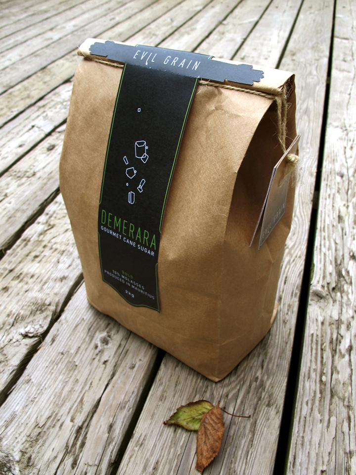
Evil Grain is a conceptual gourmet sugar company based in Canada. It has been tailored to appeal to foodies and javaheads who are looking for the best sugar for their coffee, tea, BBQ sauces, desserts, and cooking.


The ideas of gourmet and quality were the main communicational objective in these labels. Above are six different approaches aimed at the same goal. To imply the sense of richness and high-end, a generous amount of dark grays and blacks were used. This also allowed colour accents to be easily highlighted when used conservatively and strategically.

Die cuts of hands embracing the lids of the 300g containers were introduced to add some cheekiness and personality to an otherwise very stark aesthetic.

Initially, macro photographs of turbinado sugar grains were the main visual, but stylized outlines of the different kinds of sugars took their place, favouring a more minimalist and unique look. The sugar crystals take a vertical shape and are centered on each label. Die cuts on the bottom of some of these preliminary labels accentuate this vertical movement. In the end, the bottom left concept was pursued for further development into the finals.

DIN was chosen for its legibility and understated personality. Its thinner cuts (and condensed cuts as well) are very elegant and was the perfect choice for what Evil Grain wants to communicate.

Below are the final labels. Note that each illustration reflects the grain size, texture, and consistency of the sugar it represents. Busier inormation like nutritional charts, romance copy, barcodes, etc. were moved to a small booklet. These booklets are secured underneath the labels by twine (white, beige, and brown according to the darkness of the sugar) and act as a way to easily tear through the perforations of the label.