
Wednesday, August 8, 2012

Thursday, August 2, 2012
Evil Grain

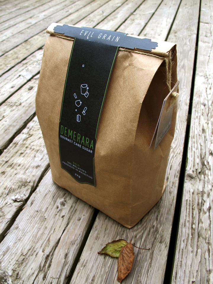
Evil Grain is a conceptual gourmet sugar company based in Canada. It has been tailored to appeal to foodies and javaheads who are looking for the best sugar for their coffee, tea, BBQ sauces, desserts, and cooking.

The ideas of gourmet and quality were the main communicational objective in these labels. Above are six different approaches aimed at the same goal. To imply the sense of richness and high-end, a generous amount of dark grays and blacks were used. This also allowed colour accents to be easily highlighted when used conservatively and strategically.
Die cuts of hands embracing the lids of the 300g containers were introduced to add some cheekiness and personality to an otherwise very stark aesthetic.
Initially, macro photographs of turbinado sugar grains were the main visual, but stylized outlines of the different kinds of sugars took their place, favouring a more minimalist and unique look. The sugar crystals take a vertical shape and are centered on each label. Die cuts on the bottom of some of these preliminary labels accentuate this vertical movement. In the end, the bottom left concept was pursued for further development into the finals.

DIN was chosen for its legibility and understated personality. Its thinner cuts (and condensed cuts as well) are very elegant and was the perfect choice for what Evil Grain wants to communicate.
Below are the final labels. Note that each illustration reflects the grain size, texture, and consistency of the sugar it represents. Busier inormation like nutritional charts, romance copy, barcodes, etc. were moved to a small booklet. These booklets are secured underneath the labels by twine (white, beige, and brown according to the darkness of the sugar) and act as a way to easily tear through the perforations of the label.




Thursday, July 5, 2012
Tuesday, June 26, 2012
Friday, June 15, 2012
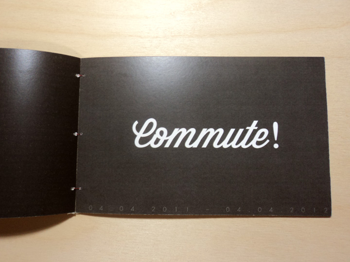
commute!



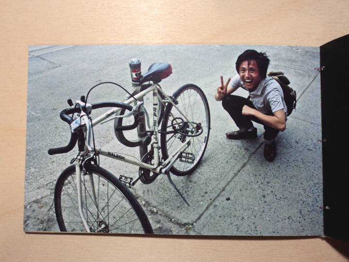


Some of the math is wrong now that I look through it. There's no way I could bike Saskatchewan in 12 hours lol, even if I was going a constant 40kmph... which would be insane
Tuesday, June 12, 2012
YARN book press


An identity for an imaginary book press.
There wasn't much of a game plan or underlying concept that I carried into this one. It's the first major project I've approached with the sole strategy of just wanting it to look good. I'll admit it; I was lazy. Designing this was all in all, pretty unrewarding. It felt like a warm up or an exercise if anything. Figuring out how to put together a physical package and making the coaster was interesting though, and I do like the logomark.
Thursday, June 7, 2012

Tuesday, May 29, 2012


Subscribe to:
Posts (Atom)